


Final Design

Who we interviewed - 5 Users currently signup for TrueSight.me (Investors,Web marketers, Entrepreneurs)
Pain Points We found
• The visual elements on the dashboards are not organized in a user-friendly manner and need improvement in design.
Navigation is not intuitive, causing users to become frustrated and easily leave the site.
Current users have a clear goal in mind when using the website and dashboard, as indicated by the use cases.
To improve the product, we will create a persona from the following:
• a business person who has some savings and wants to invest but doesn’t know where to start
• an investor who wants to save his/her research time
• a student who wants to start investing but doesn’t know where to start
Final Persona

Key Changes:
• Make the site flow clear to help users find information more easily.
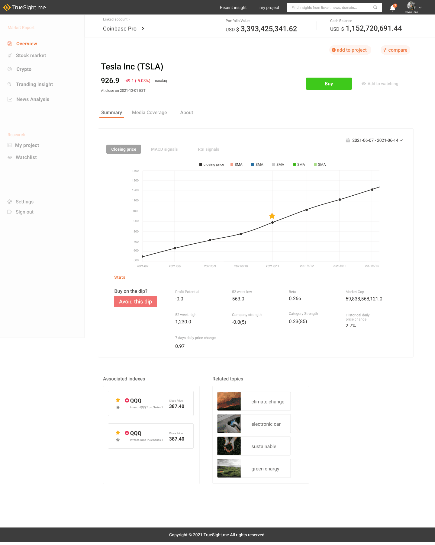
Prioritized key pages that need redesigning (Redesign Sell Off (Stock page) and Company Info page).
Create experience for user want to check the app regularly (e.g. alert, notification, seamless flow)


Task
1. Determine current stock recommendations.
2. Identify a potential investment company.
3. View the company page and add it to the watchlist.
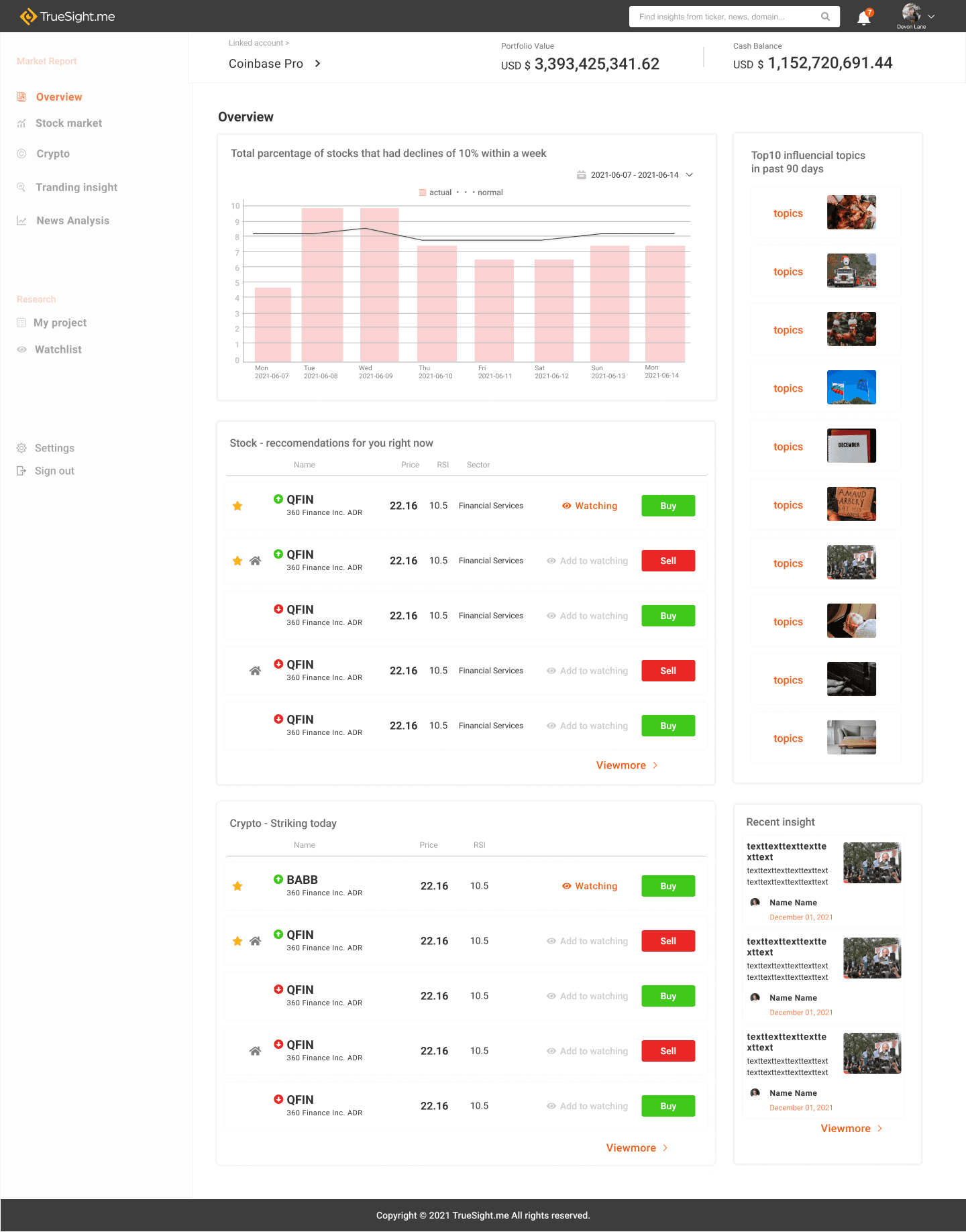
Improvement
• Remove two contents on the right of the page
• Rename contents to match what users can imagine easily

